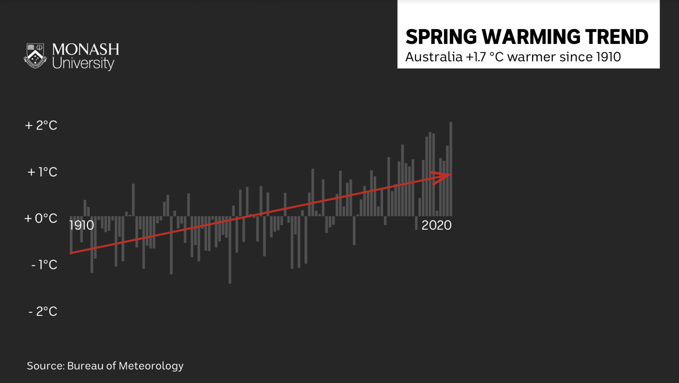
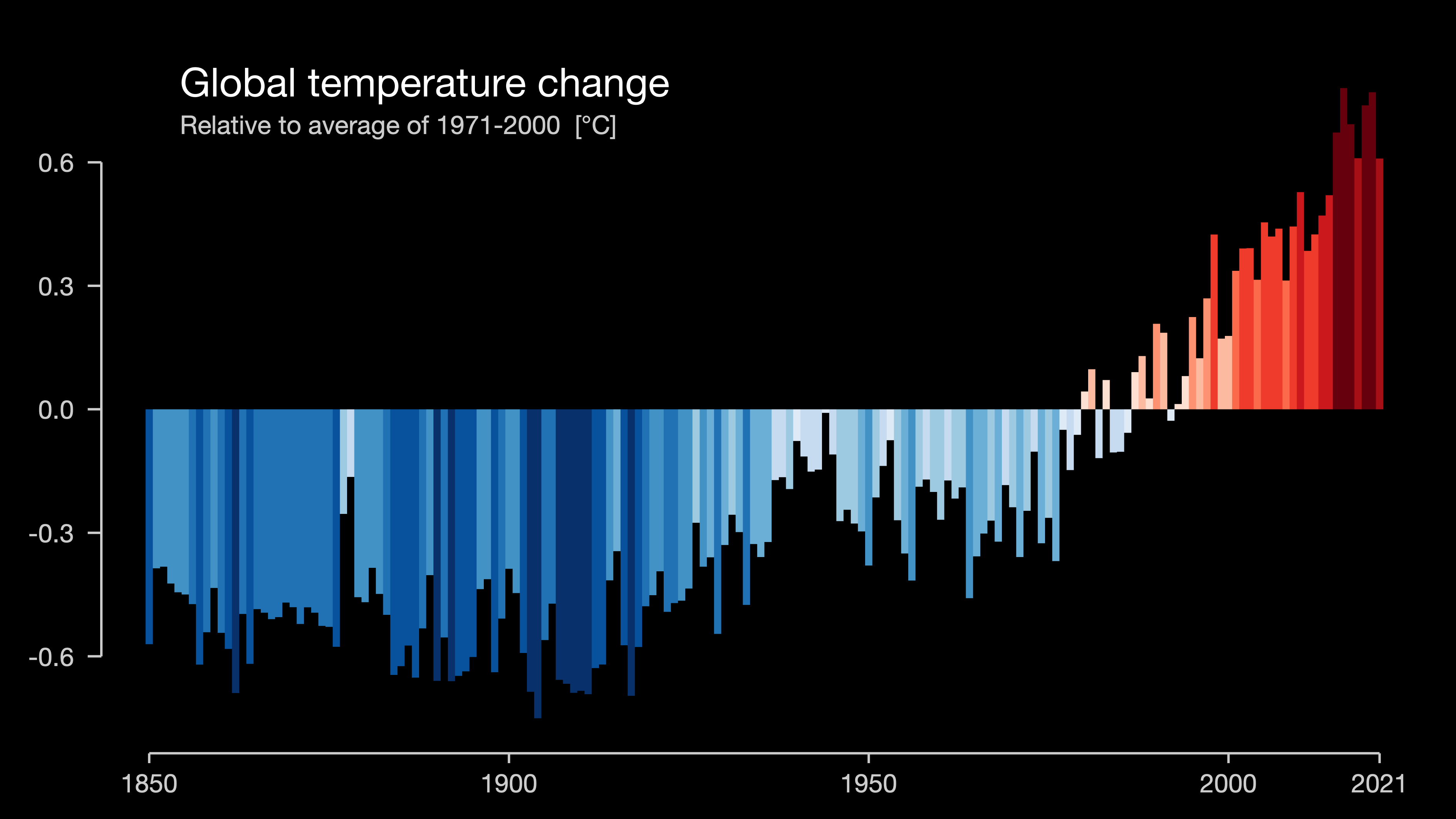
When I was a climate + health researcher, I made graphics like this:
Then I worked at the Monash Climate Change Communication Research Hub, and I made graphics like this:
Now I work for 360info, an open access newswire supported by Monash. Now I make graphics like this:

360info is an open access global information agency that tackles the world’s biggest challenges and offers practical solutions.
Keen to collab with research groups and media outlets!
I’ve been working at 360info for about a year
We’re a research-driven newswire, and we give everything away for free under Creative Commons so that all journalists can benefit from it
Part of my role is creating our visuals. (click)
That means I do everything: coding, design and analysis.
As our team grows, I’m also working with our infrastructure partners and looking for ways to make it easier for reporters and editors to use our charts
Slides
https://numbats2022.talks.jamesgoldie.dev
(Code for these slides is at https://github.com/jimjam-slam/talk-numbats-2022)
So I’ve spent a bit of time this year talking about my experience with broadcast climate graphics.
Short and long reads
TV graphics: the short read
TV graphics generally have to work within a fixed amount of time.
If you’re really lucky, that time could be 30 or 40 seconds
If you’re less lucky, it could be 15 seconds.
Or 15 seconds that turns into 7 seconds right before you go to air.
So you can see why the graphics I made after I graduated didn’t have seven line captions on them.
I’ve become really interested in the difference between “HERE IS A QUICK MESSAGE” and “Here’s a long, considered message to digest slowly…”
TV graphcs: the long read
That said, TV graphics don’t always have a fixed amount of view time.
They can be republished online or replayed
| Long view bad ❌ | Long view better ☑️ | |
|---|---|---|
| Short view bad ❌ | Bad chart | Requires context or time |
| Short view good ☑️ | Misleading/reductive/ oversimplified | 🥳 |
This is obviously a super reductive way to talk about how long we look at chart - there are ways to tackle the long view in certain contexts, like building a graphic up piece by piece, or introducing concepts earlier in a story.
But I think it’s helpful to think about short and long views because it helps us figure out how much simplification is necessary.
Layered complexity: climate stripes

I’m also not suggesting that every graphic should avail itself of hidden meaning if you stare at it long enough.
Some graphics are designed for a specific purpose. The climate stripes are a good example of this:
They tell a really simple message that really only depends on a basic awareness of the idea of climate change
But if you need to talk about anything else, they can be too simple.
Layered complexity: climate stripes
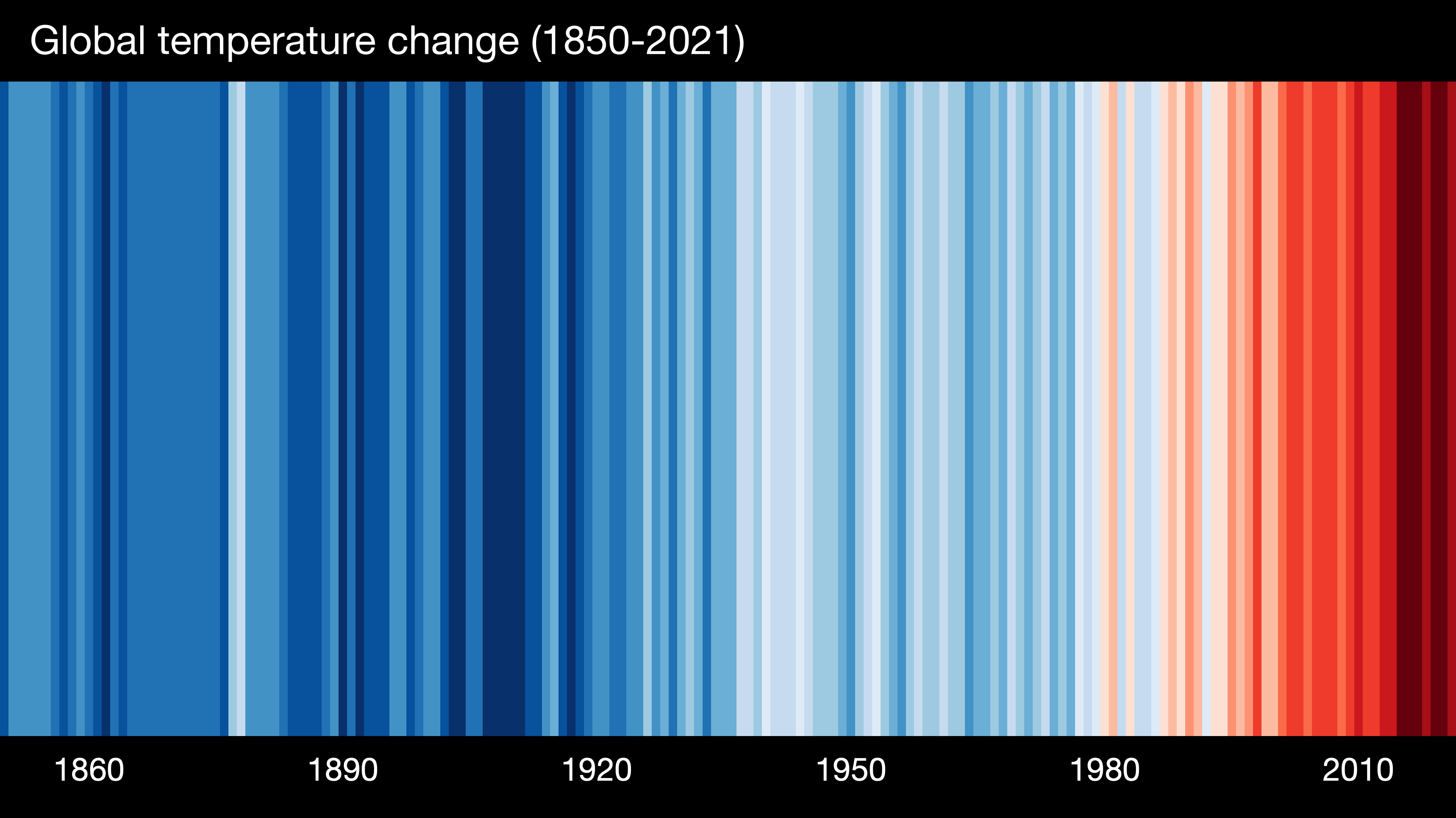
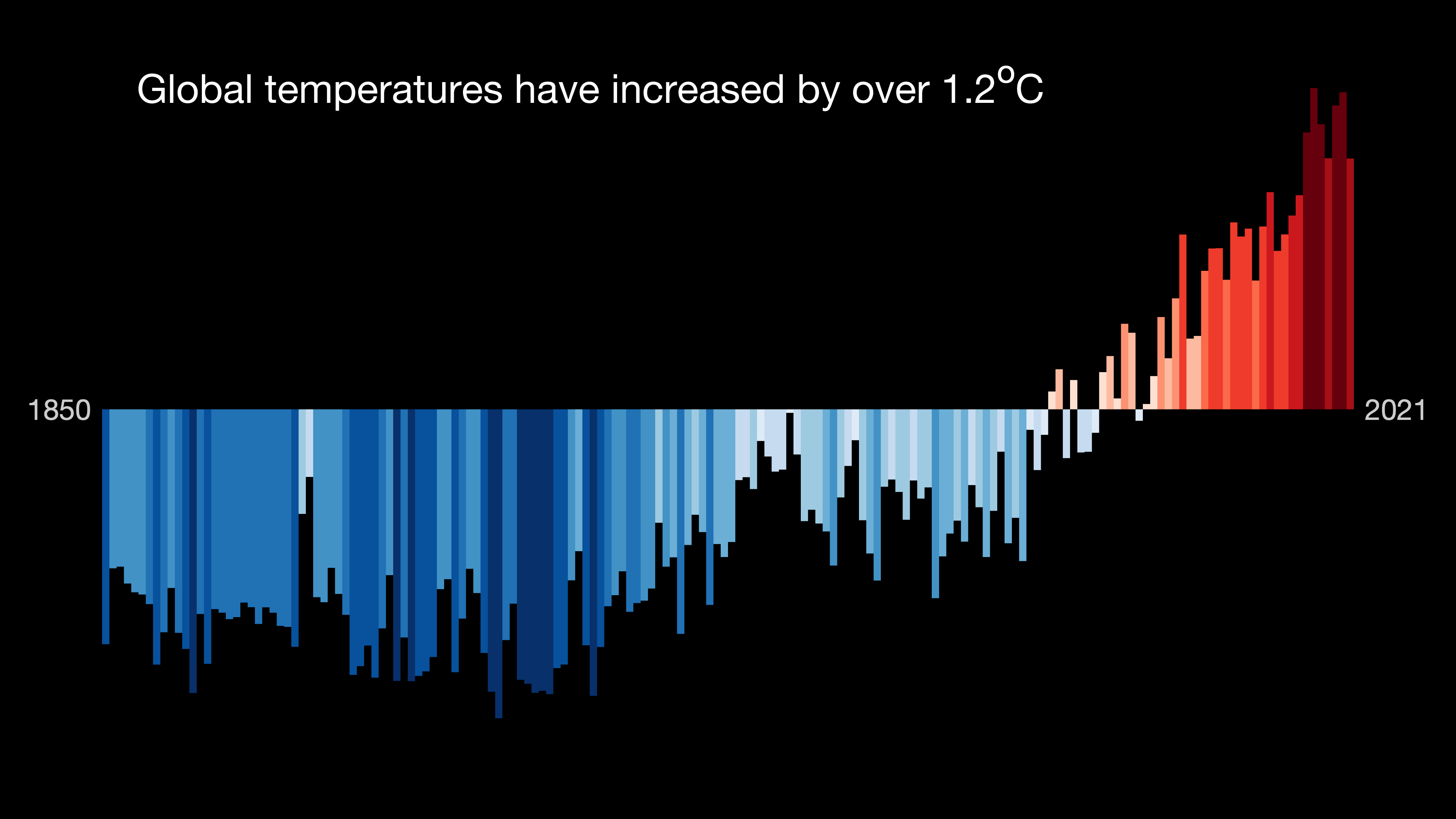
In fact, the climate stripes website has variations you can download that add more typical chart elements, like axes, or even turning them into a conventional barchart.
Even this last chart doesn’t explicitly say what the measurement is.
Example
❌
I had an interactive bit planned here, but we don’t have time! 😅
Temperature jargon
I’m going to retread a bit of what Amanda has talked about this morning looking at text, because text is a big part of clear communication, especially on TV!
Plus, a good chunk of physical climate is the patterns we see across time and space
That means we have a lot of jargon for talking about spatial and temporal scales
Relating climate to weather
Jargon
daily maxima
maximum daily maximum
area-averaged temperature
(Possible) alternative
daytime temperatures
hottest day
temperature across Australia
“Climate is what we expect; weather is what we get”
This is a tricky dance: in some cases we can get away with an apparent loss of precision in our words, because of the context.
It’s also something that relies on the assumption that audiences have been trained by TV weather segments
(Could this be less effective in the future?)
“Daytime temp” != “Maximum temperature”, but audiences have been trained to relate the two.
(So long as the difference isn’t important to this application!)
The other interesting thing is that people’s intuition starts to drift - not just with complexity in the measure, but with the time and especially space scales
When we talk about daily temperature in a city, people link it to their experience
If we talk about a hot day across Australia, that’s a little harder to grasp!
Once you get to the point of a country or the globe having a hot or cold year, it starts to be more of an intellectual exercise
Using less jargon
Using less jargon
That use of language can particularly pay off when you start thinking about the future climate.
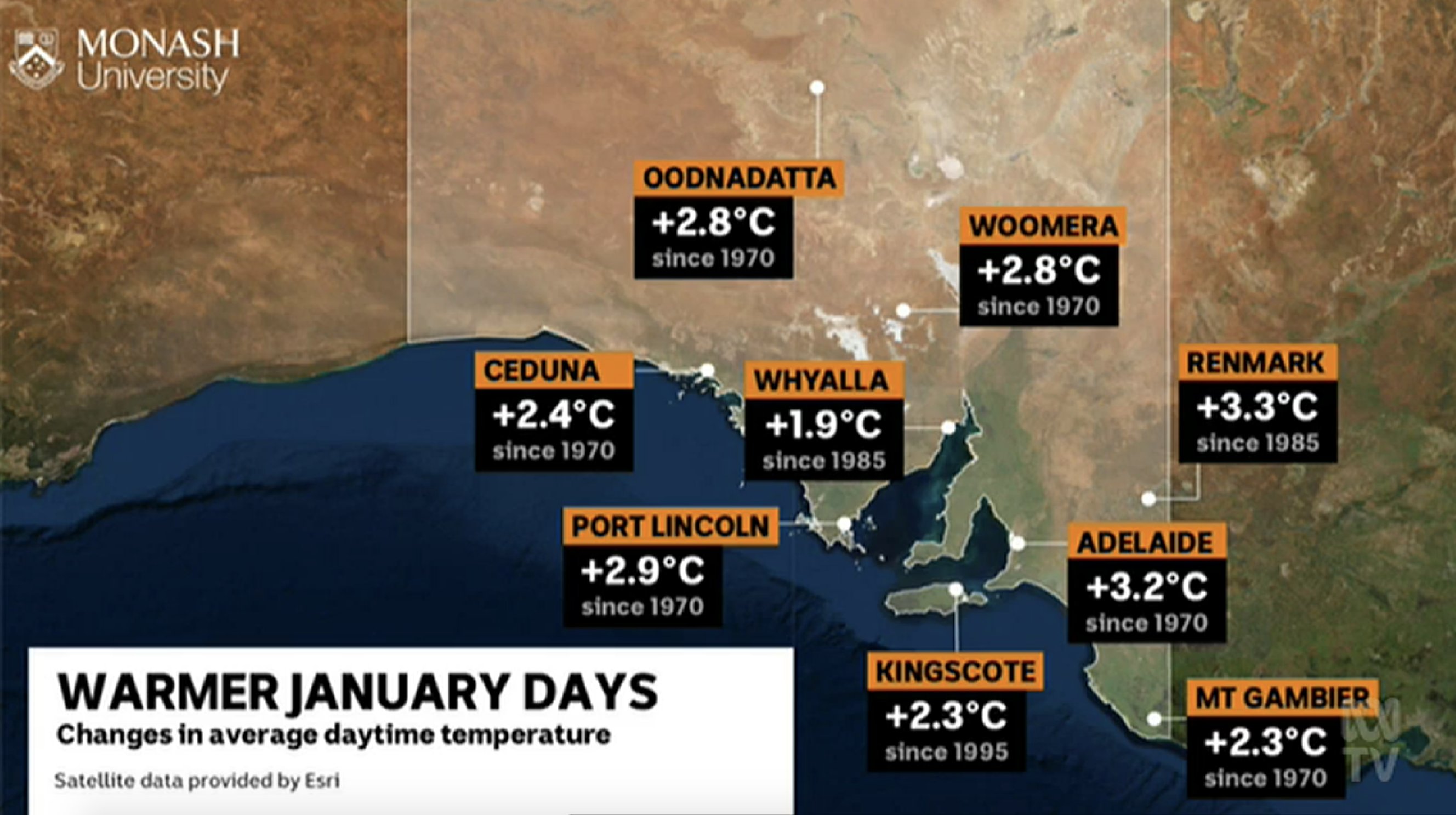
Last year we were able to collaborate with the National Environment Science Program to get climate projections on screen, which was pretty rare up until the COP talks in Glasgow last year.
In this case we talked about how winter days have been changing across the country to try to establish that intuitive experience of weather
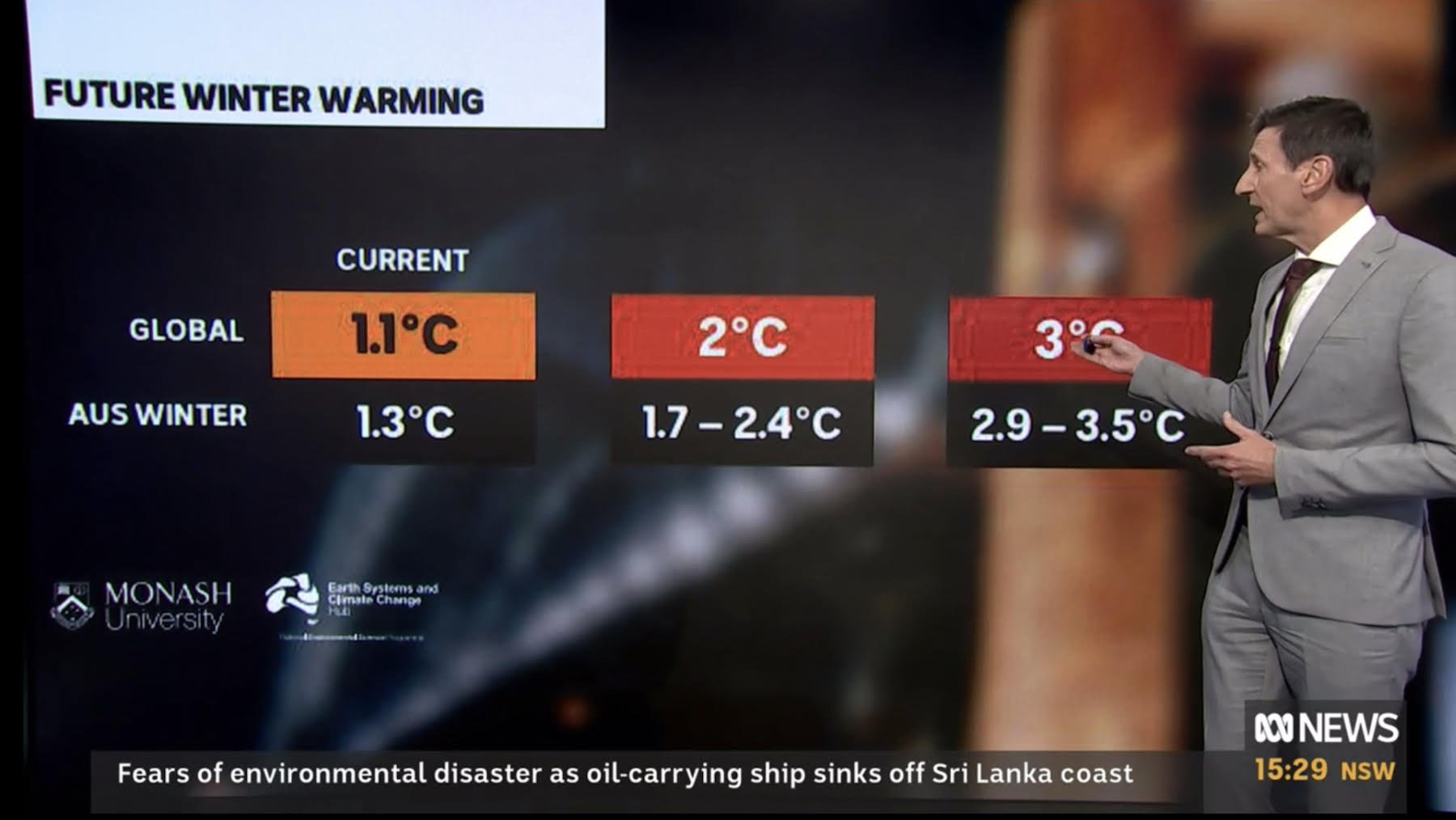
Then we followed it up by relating global warming levels to seasonal projections of winter temperatures in Aus.
There’s a bit of spread in the modelling here, and so we decided to just go with ranges in text rather than try to do a visualisation with an error bar on it.
We generally try to steer away from the word “uncertainty”
Downside is the possibility that this might seem like a uniform distribution, but I honestly think this is pretty low down the list of worries.
Rainfall projections
and uncertainty
All of this is fine when we’re talking about heat, because the relationship between global warming and extreme heat is really clear.
It would be really hard to find a definition of heatwaves that isn’t getting worse in most parts of the world.
Rainfall is another beast:
- rainfall patterns are changing in different ways around different parts of the world;
- changes are very dependent on how you define extreme rainfall;
- climate models less confidence in future rainfall changes than temperature
So future rainfall stories can be challenging to tell quickly.
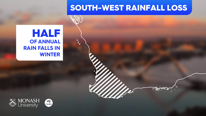
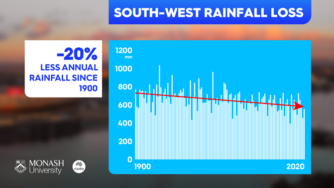
Perth is drying out in the winter
Cool season total rainfall (mm)
Perth has lost over 25% of its rainfall in the cooler months (April to October).
These months are critical for the growing season.
import {addTooltips} from "@mkfreeman/plot-tooltip"

perth = FileAttachment("data/perth-rainfall-obs.csv")
  .csv({ typed: true })

// convert year to date
perthData = perth.map(d => ({ ...d,
  startDate: new Date(d.year + "-01-01"),
  date: new Date(d.year + "-07-01"),
  endDate: new Date(d.year + "-12-31")
}))

// calculate man rainfallx
rainfallArray = perth.map(d => d.total)
meanRainfall =
  rainfallArray.reduce((a, b) => a + b, 0) / rainfallArray.length

perthChart = addTooltips(
  Plot.plot({
    grid: true,
    marks: [
      Plot.rectY(perthData,
        {
          x1: "startDate",
          x2: "endDate",
          y: "total",
          // fill: "total"
          fill: "#7ceaf2",
          title: d => `${d.year}\n${d.total} mm`
        }),
      Plot.linearRegressionY(perthData, { x: "date", y: "total" })
    ]
  }),
  {
    fill: "#2478bd",
    stroke: "#2478bd"
  })
But rainfall stories are important!
Perth—all of SW Aus, in fact—has a rainfall problem.
Specifically a winter rainfall problem.
In the cooler months between April and October, Perth has lost a quarter of its rainfall over the last 120 years.
This is one of the clearest signals on total rainfall in the world
And it’s a place where climate models agree we’ll see more declines
So how do we tell that story?
Messages
- Winter rainfall going down
- Bad for agriculture
- We expect the decline to continue
- Less warming = less decline
Challenges
- This decline is clearly in the cool season (esp. winter)
- We have seasonal rainfall projection figures, but…
- Only annual maps (not seasonal)
Establish critical time for agriculture
Only mention of seasonality is here 😔
Establish observed decline
(These are annual figures - note smaller trend)
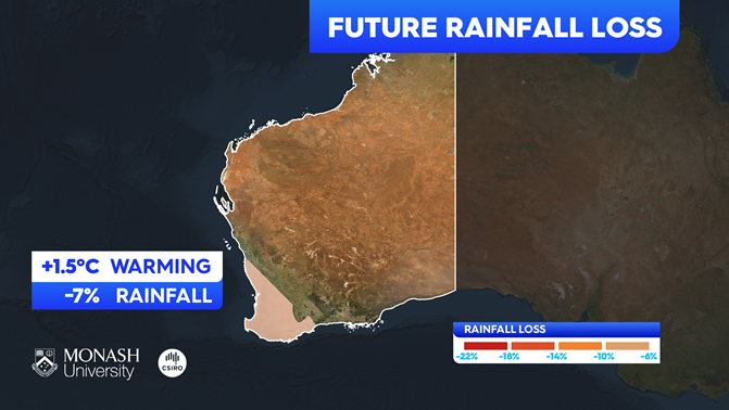
Continue to future projections
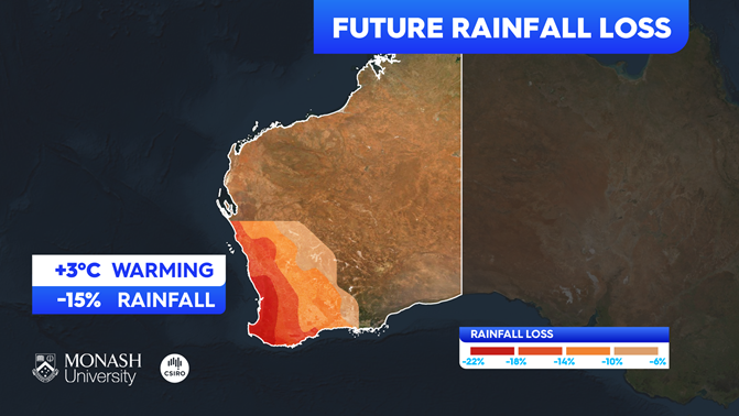
Note that legend is the secondary way of establishing colour scale
- (Good if it gets republished online but unlikely to be read quickly, especially at this size)
Annotation establishes range and headline
Like most maps, this has no discussion of uncertainty.
As we know, that’s a common problem with raster maps: you get a less of extra complexity with very little cognitive overhead with 2 or 3 spatial dimensions…
… but you’re also kind of in a corner after that.
Visual alternatives for uncertainty
Tooltips?
- Great for an interactive… not so much for broadcast 😔
(Di/tri)chromatic maps
- Too esoteric for TV audiences 🤔
- Probably violate contrast guidelines as well
If this was an interactive we could have a tooltip that gives more detail, and I believe Tony is talking about interactives next!
You could do a dichromatic or trichromatic map, where you try to encode several sets of information into your fill colour.
But nobody knows what they are, and they’re really hard to read.
Non-visual alternatives for uncertainty
Choosing stories where we can be clear
- (But recognising that stories featuring uncertainty are still important and looking for the best way to tell them)
Highlighting sources of uncertainty where they’re relevant, instead of putting all the fine print on all the time
In this case we chose to highlight on a case where the models agreed on the sign of the change, and we tabled discussion of uncertainty.
You might disagree with that, and I’m not sure I 100% agree either!
Def not advocating for leaving uncertainty or nuance by the wayside.
Also not advocating p-hacking! (Climate models are not statistical models!)
But in this case case we also thought as carefully about what to visualise as how to visualise it.
Doing a clear but scoped story might be better than doing an ambitious but unclear one.
The other possibility is highlighting sources of uncertainty where and when they’re relevant.
My old supervisor at CLEX used to say that he preferred to communicate uncertainty holistically
Instead of focusing on one or key metrics, he advocated for having that discussion in a fuller way
That’s really hard with large audiences, but I think it can be done in some cases if approached thoughtfully
For my next project, I’m working with climate projections again. Although it’s an interactive and we can have ranges, I’m hoping to highlight key sources of uncertainty for interested users where they are important with an additional tooltip.
Conclusions
Graphics should be digestible quickly…
but still useful if read for longer
Use language and context to reduce cognitive load
You have many tools for conveying complexity…
and not just visual ones!
Thanks for listening!
Questions?